At the University of Newcastle our enterprise service management tool is ServiceNow (SNOW). In DTS we this platform across many of our services including our Service Desk in order to track all aspects of service delivery both external and internal.
For an organization using an platform like SNOW, feedback surveys are an essential way to gather user insights and identify areas for service delivery improvement. Because of the frequency of automated surveys, response rates are naturally lower than other kinds of engagement surveys.
| Response Rate | Assessment |
|---|---|
| Under 5% | Needs Improvement |
| 10% – 15% | Acceptable / Average |
| 15% – 25% | Very Good |
| Over 25% | Exceptional |
Below is a chart of how response rate benchmarks typically are broken down for IT feedback surveys.
In 2024 it was identified that only 3.7% of surveys delivered automatically upon request/incident completion were being filled out by requestors. This quantitative insight led to a collaborative effort across DTS to further understand the problem and find a solution.

To uncover more qualitative insights to accompany our quantitative data, discussions were had with a variety of users of the tool including both requestors and fulfillers.
The below comments capture some of the insights we received from users.
“I didn’t know there was a survey to complete, I wouldn’t mind doing one.” - Requestor
“There’s a feedback survey? Where do I even see the results?” - Fulfiller
“I have seen the email before but I thought it was just a reminder that the ticket was complete” - Requestor
These insights confirmed that the problem was occurring in the final steps of the journey where the requestors were receiving their automated survey email.
Now we had a place to start, an approach was determined.
Reworking content to be more encouraging and explicitly explain the primary purpose of the email
Surface the main question of the survey to be more transparent about what is being asked.
Review and redesign the visual heirarchy, prioritising important information while bringing the email in line with brand guidelines
Examining the existing email
The existing automated email was found to have several factors contributing to increased cognitive load and lack of scannability.
While it was mentioned that the requestor could provide feedback, the call to action was not concise and there was no indication of what the survey questions contained. There was also no visual contrast within the design, with the most emphasised text being the bold and underlined ‘Request Summary’ which was not a call to action. There was also no clear mention of who the email was from, as the sender was an automatic ServiceNow email which did not clearly link it back to DTS.
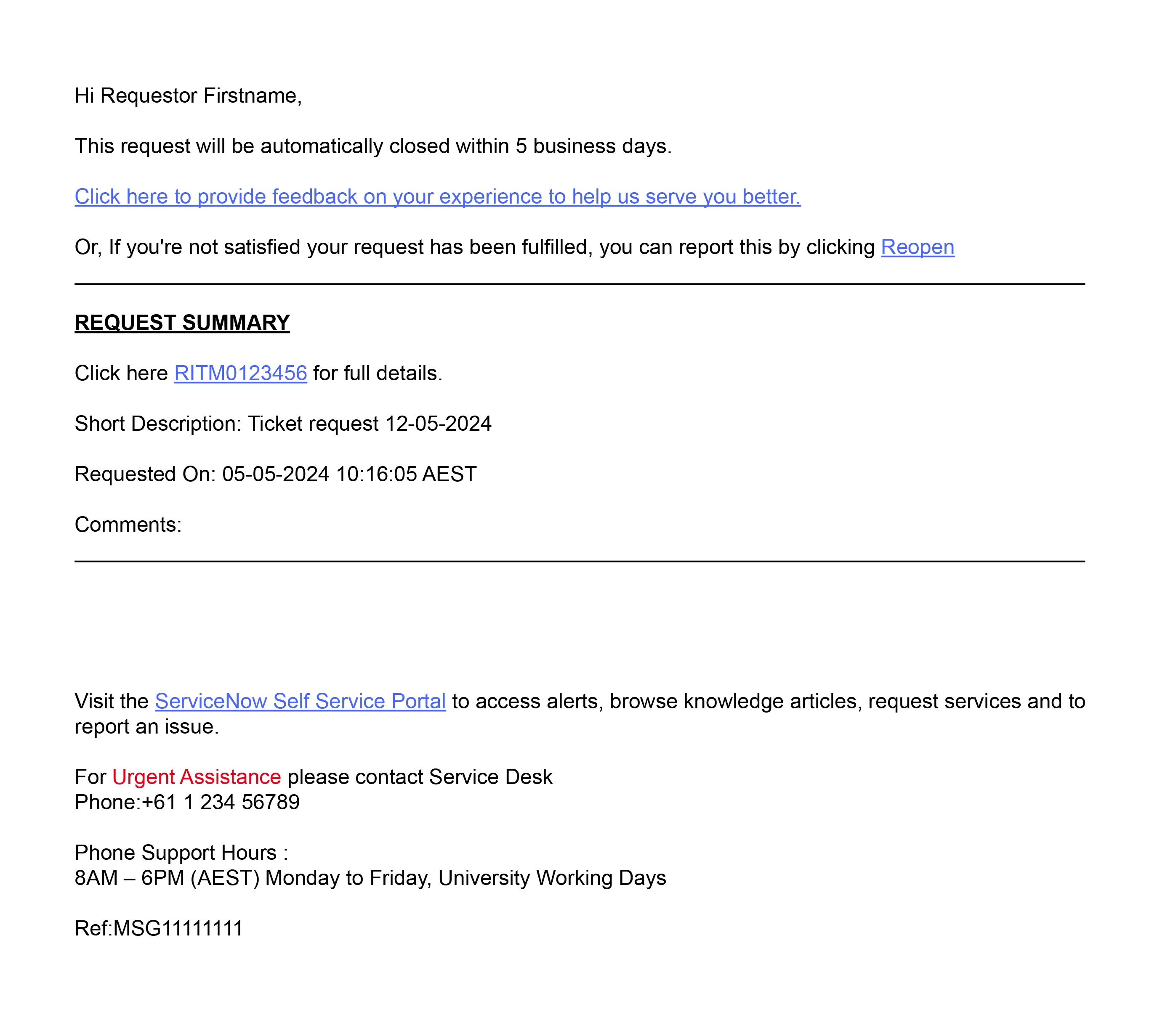
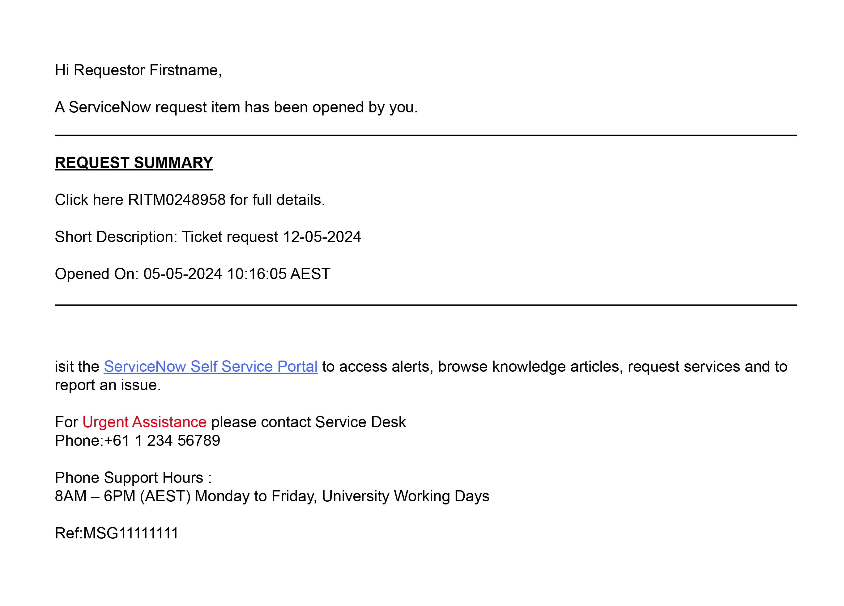
The issue of the email being ignored could also be linked to the survey email’s similarity to that of the ‘Request Opened’ automated email, which required no action.
Reworking the content
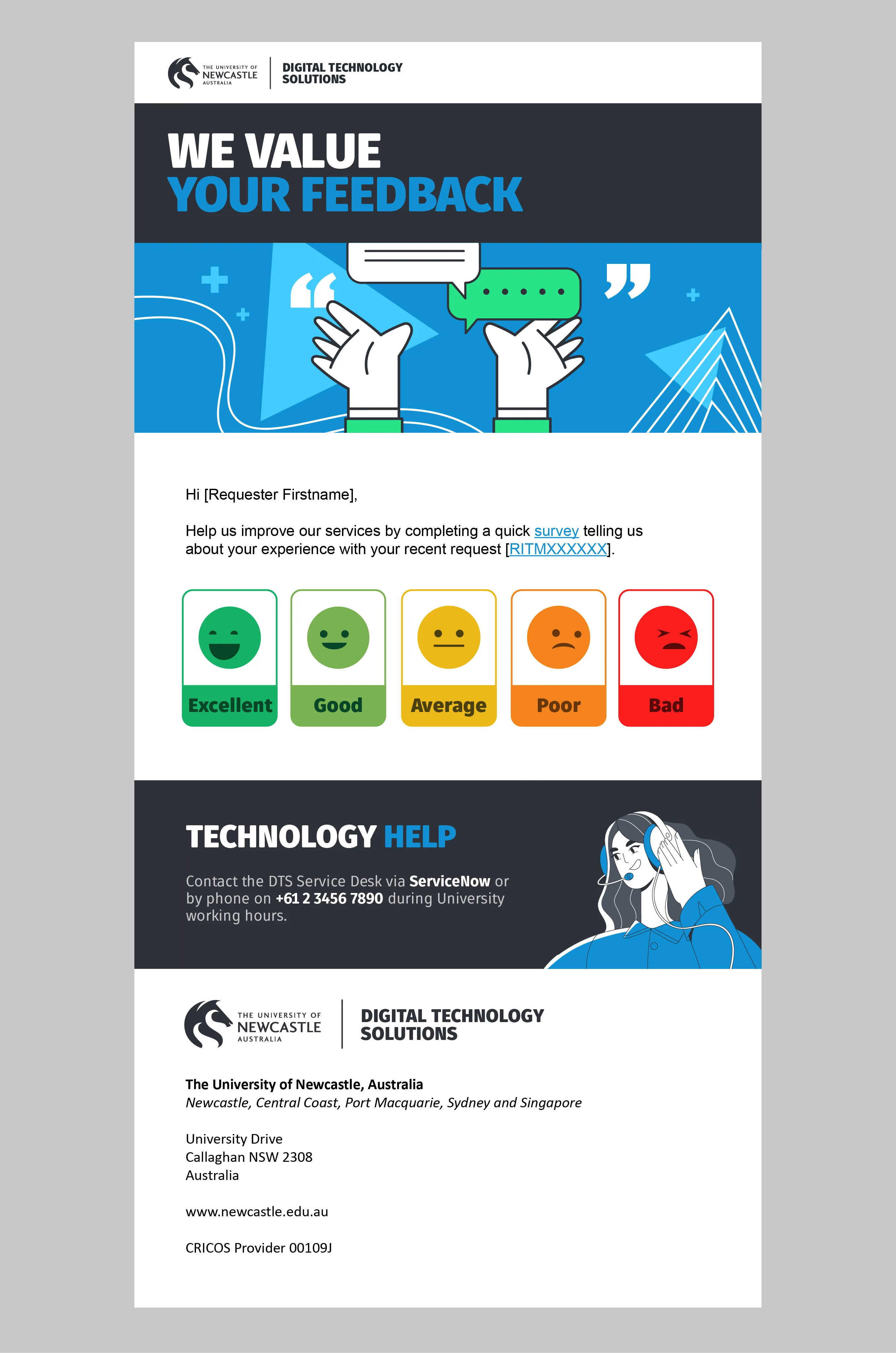
The first step in reworking the email was deciding how to address the user more directly in context of what the email was for.
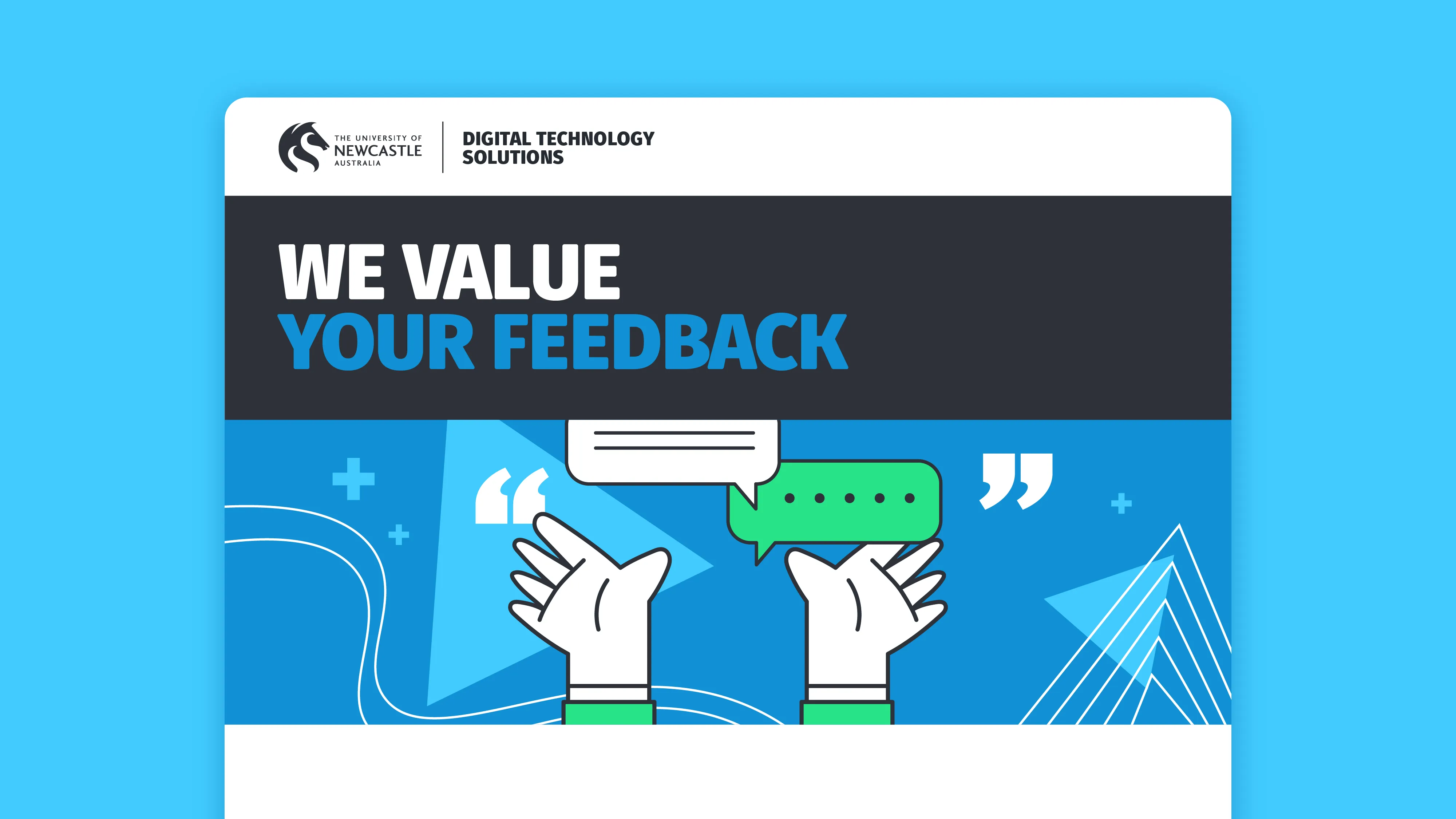
“We value your feedback.”
This became the opening sentence of the email, ensuring that the intentions were clear and would change the tone of the entire engagement.
The rest of the content was also significantly cut down to reduce clutter and cognitive load.
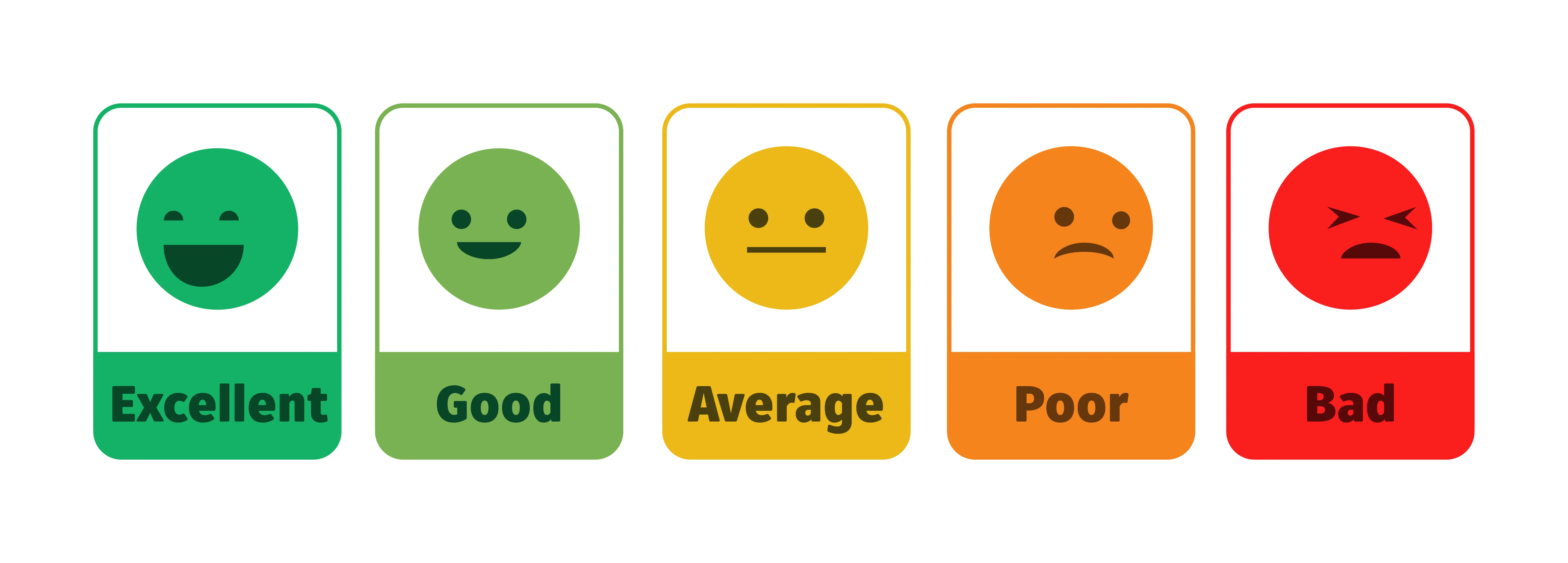
Surfacing the options
The decision was made to display the simplest part of the survey right there in the email for users to see. This would allow them to click on an option directly and be taken to the survey screen, reducing any ambiguity about what the options were.
Multiple iterations of designs to display the options were tested landing on the emoticons below.
Going from content to conversion
After the content rework and survey options were confirmed, it was time to create a brand compliant and engaging email that would achieve the desired outcomes.
I designed imagery that clearly emphasised the head heading as well as eyecatching illustrations that would signal to users that they should pay attention.
I also put the DTS logo at the top and bottom of the email to clearly show who the email was from.
I worked directly with developers to ensure they had the correct assets were provided and the implementation of the email was accurate according to the design.

In addition to changing the experience for requestors, I also re-engaged with some of the fulfillers that had mentioned they did not know where to see survey responses.
I built several filterable visualisations within their ServiceNow dashboards to allow easy visibility of feedback side by side with their tasks.