When I was onboarded in the final stages of the project preparing to deliver a complete Employee portal to University staff, I quickly realised that the current ‘out of the box’ portal design needed more design work than was initially expected.
First meeting and scope
My role in the project began with the request to create icons, topic pages and navigation banners to allow a seamless user experience across layers of taxonomy that was also in line with brand guidelines.
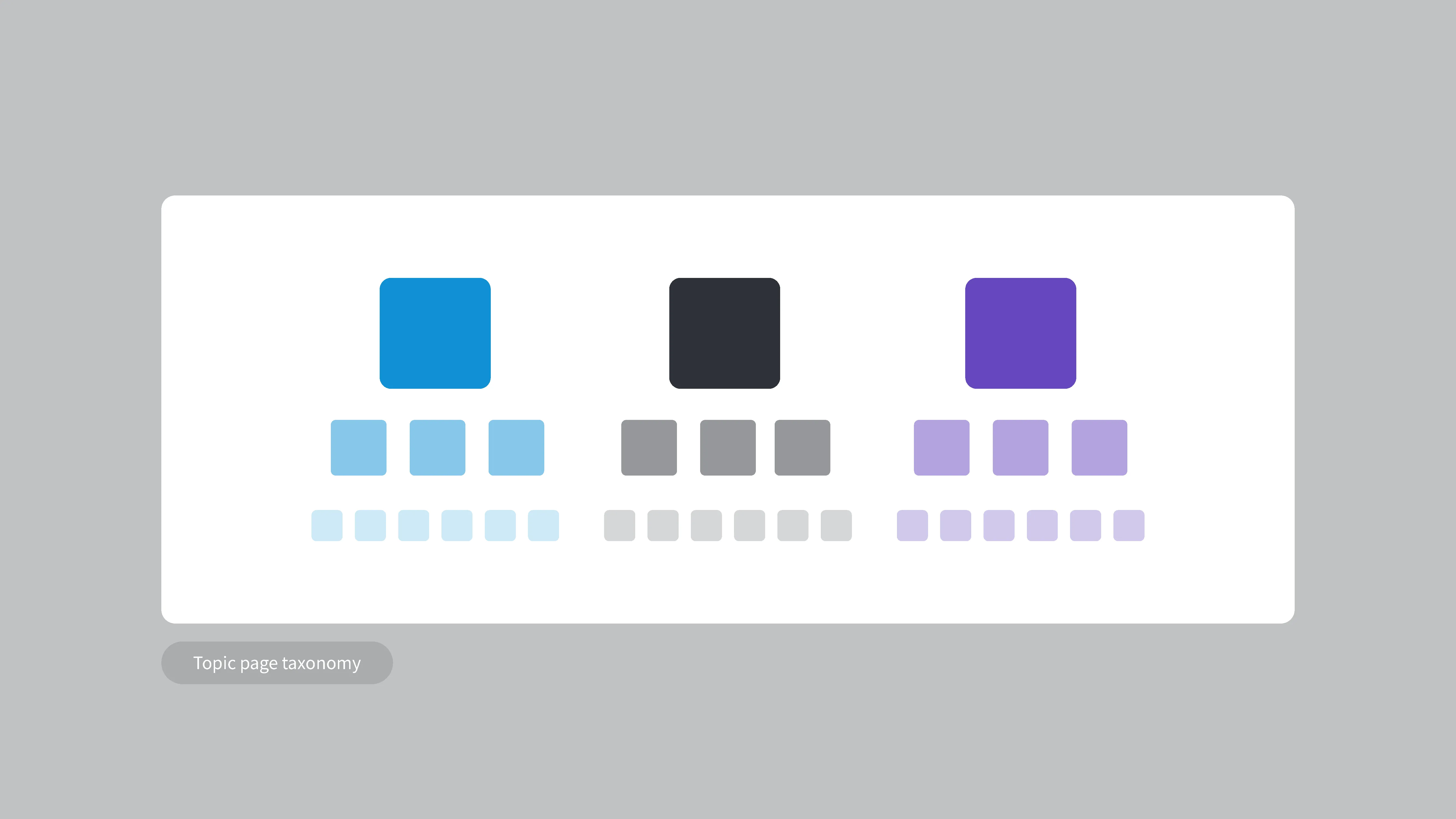
What we then worked out was that the vendor team were requiring a fully accessible University of Newcastle Design colour system to replace the out of the box system. This was before any progress had begun on the University Digital Design Toolkit.
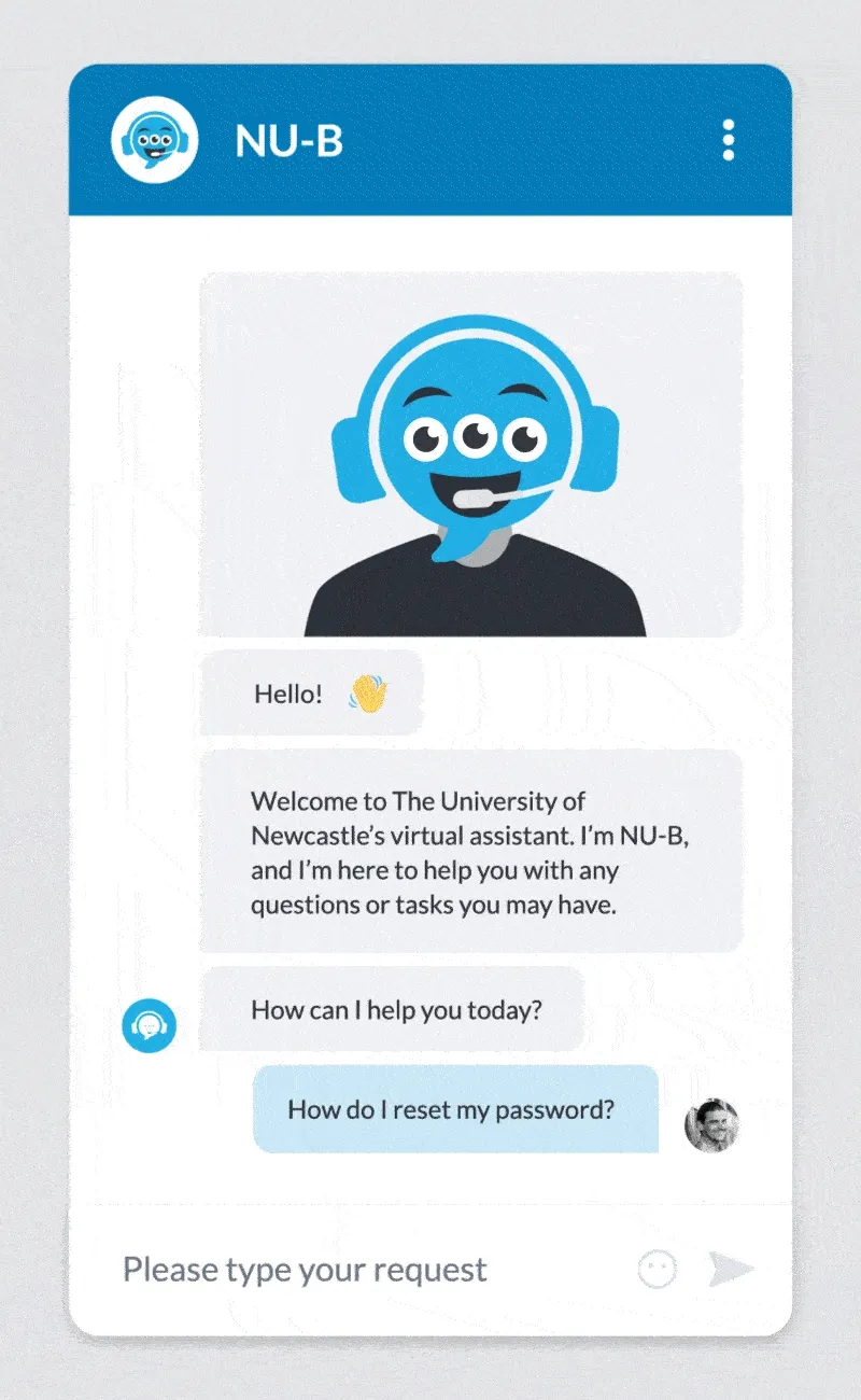
The employee portal would also feature a redesign of the NU-B virtual assistant, which would be the first time many uni staff would interact with the assistant.
With no time to engage users of the portal for my portion of the redesign, I had to rely on consultation with other DTS designers and vendor designers to test my thinking and ideas.
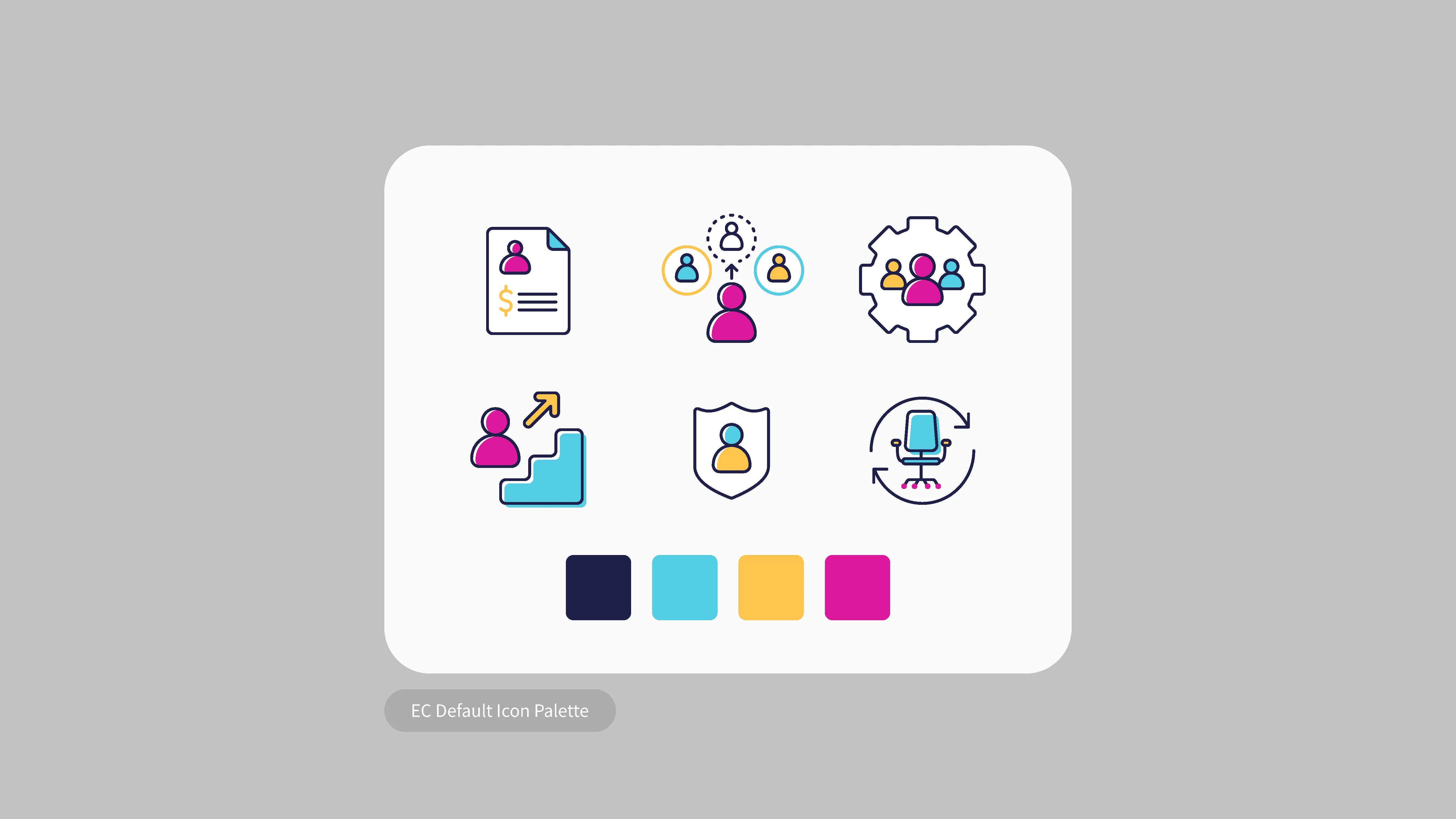
Curating the icon set
In the first consultation or ‘design jam’ I pitched a couple of options for how to implement icons across the portal taxonomy. Both options would rely on previously developed icon sets to be able to meet the strict delivery window, but in ways that would comply with Uni branding.
The first option was to make use of the available icons provided by the vendor and rework them using uni brand colours.
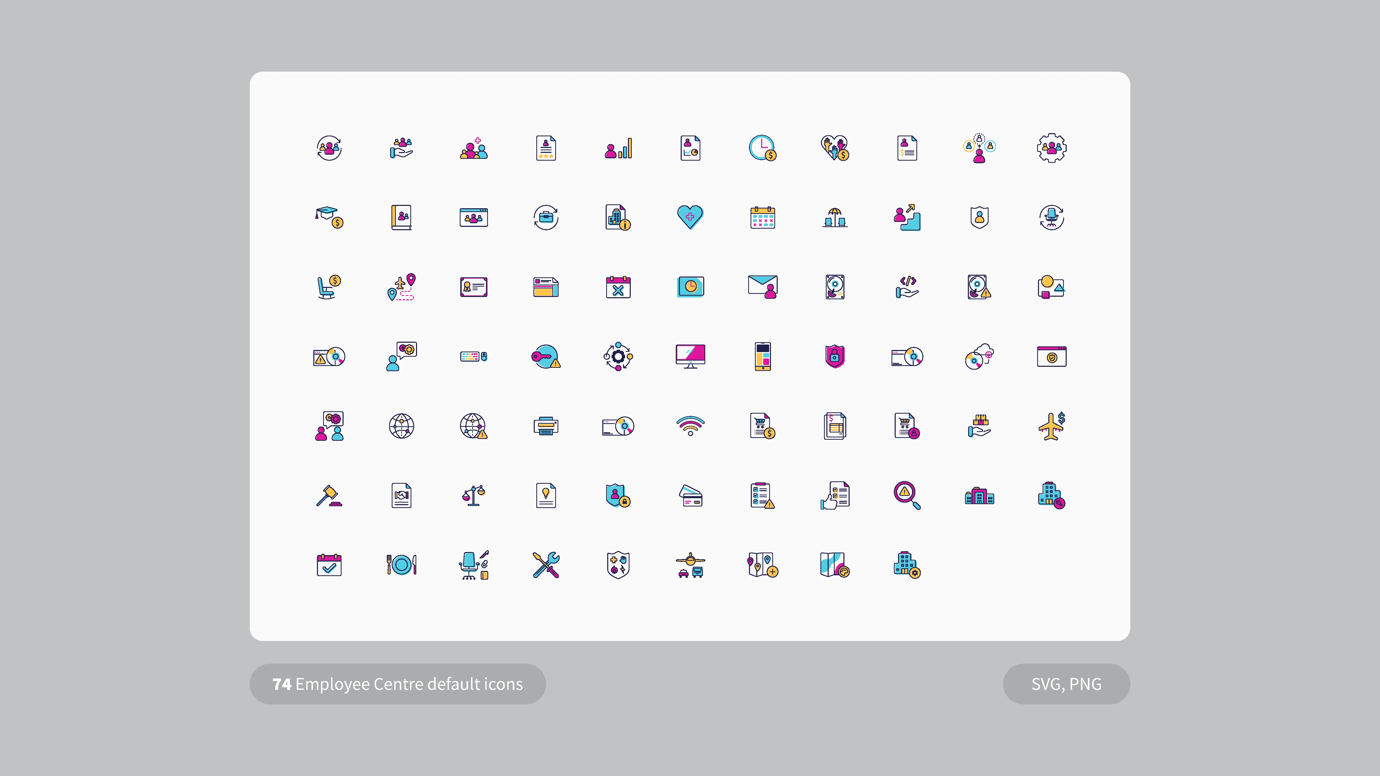
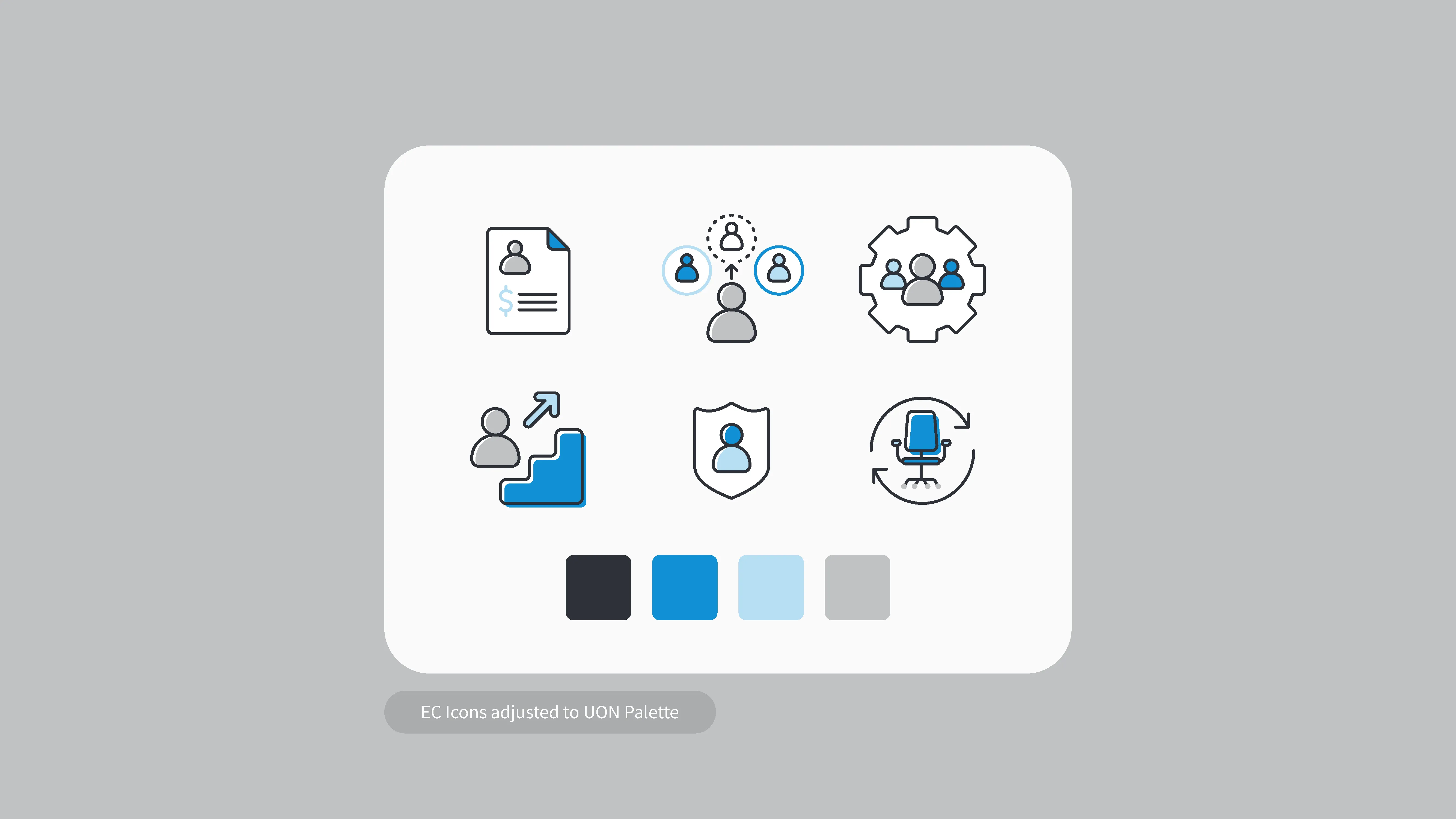
While this approach would cover most of the original page taxonomy, it was then made clear that we would need many more icons than were provided to be able to have a unique icon for each page including level 1, 2 and 3 pages.
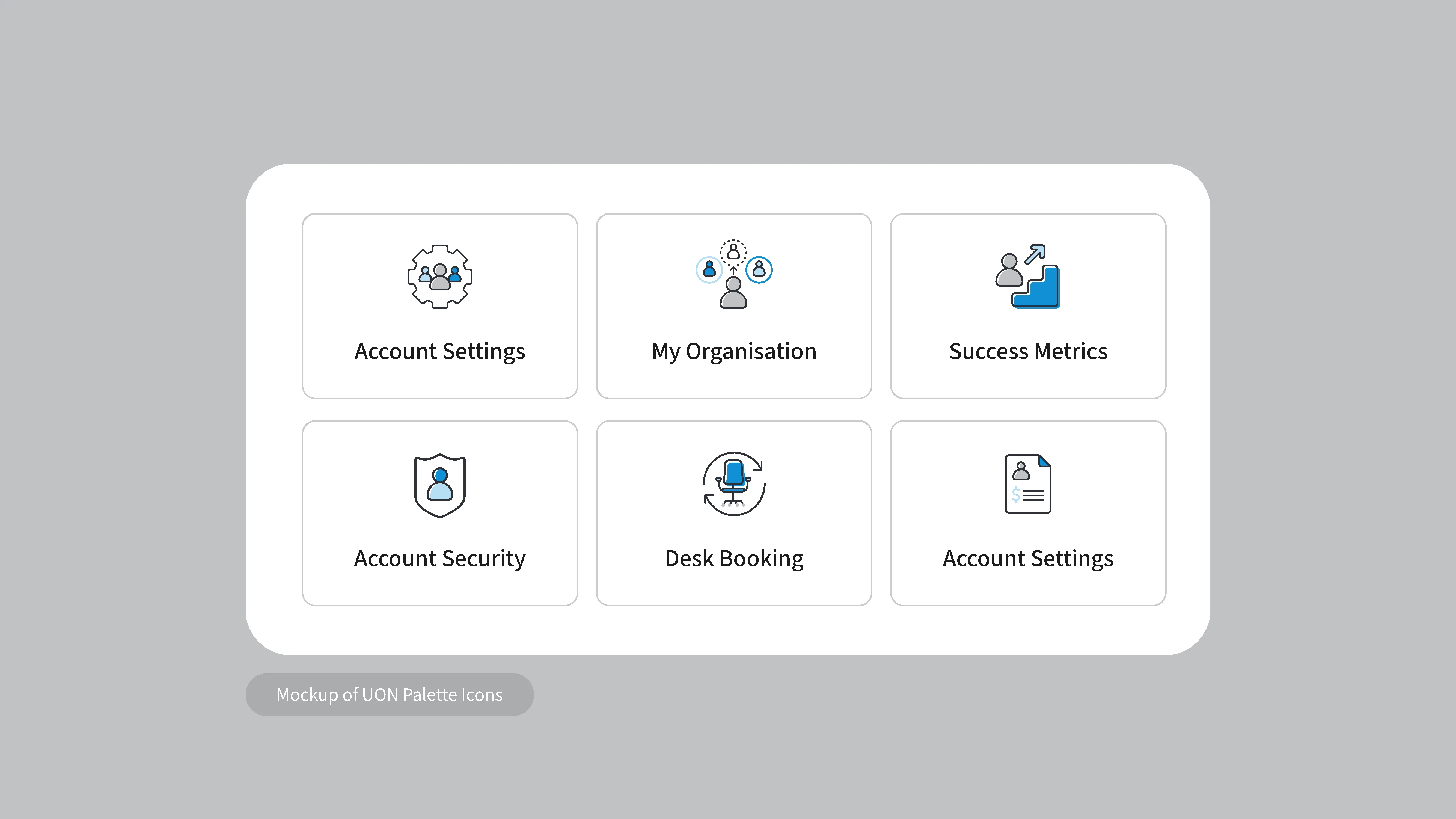
My second option was to incorporate icons from our free Icons8 subscription to supplement anything below level 1 pages, or even to just use entirely icons8 for all pages.
After presenting these options, a decision was made to remove the need for icons for level 2 & 3 pages, so the OOTB icons would be enough to cover what we needed.
Topic pages
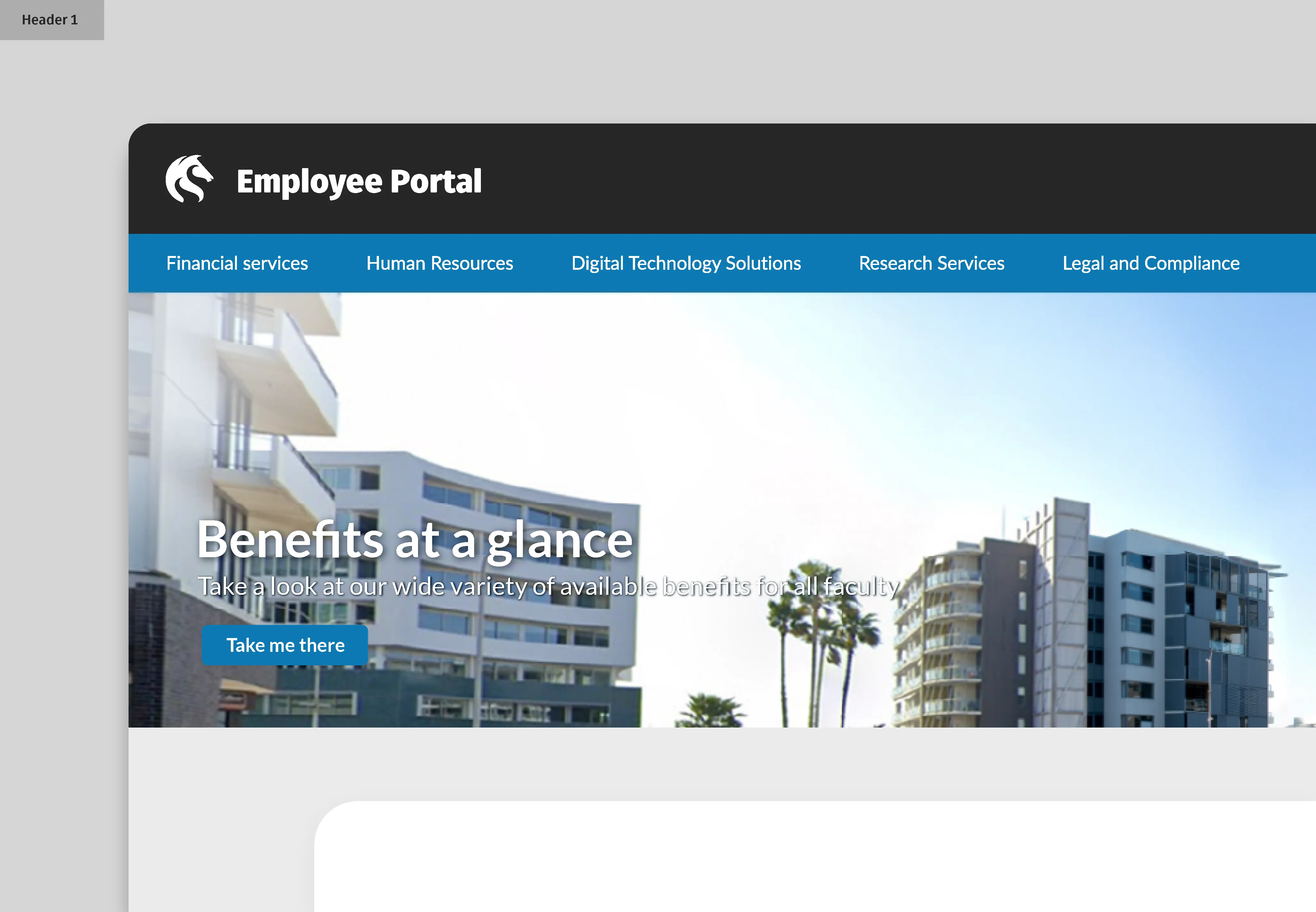
The portal was designed to have header imagery across topic pages which was initially going to be set to custom images for each topic. To reduce the risk of lots of mixed imagery confusing the user experience, I developed a system for easily creating simple topic page banners using Uni colours. While not significantly unique this was a solution that would save lots maintenance and precious time spent curating images across many topics.


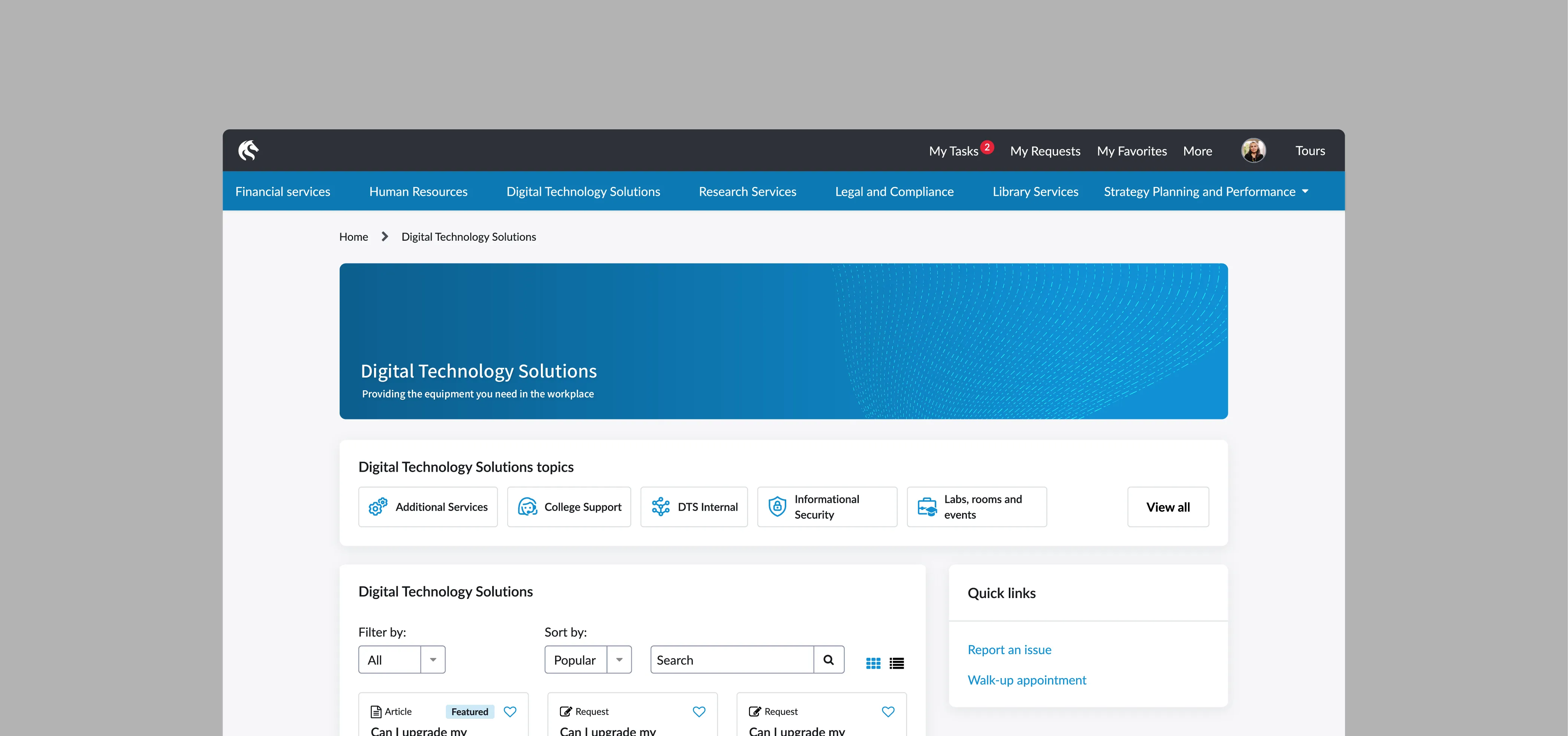
I also advocated for a small but effective implementation of the university brand typeface ‘Fuse’, as the H1 tag for each topic page. This would be a small way to introduce uni branding without creating mismatches by introducing it elsewhere.
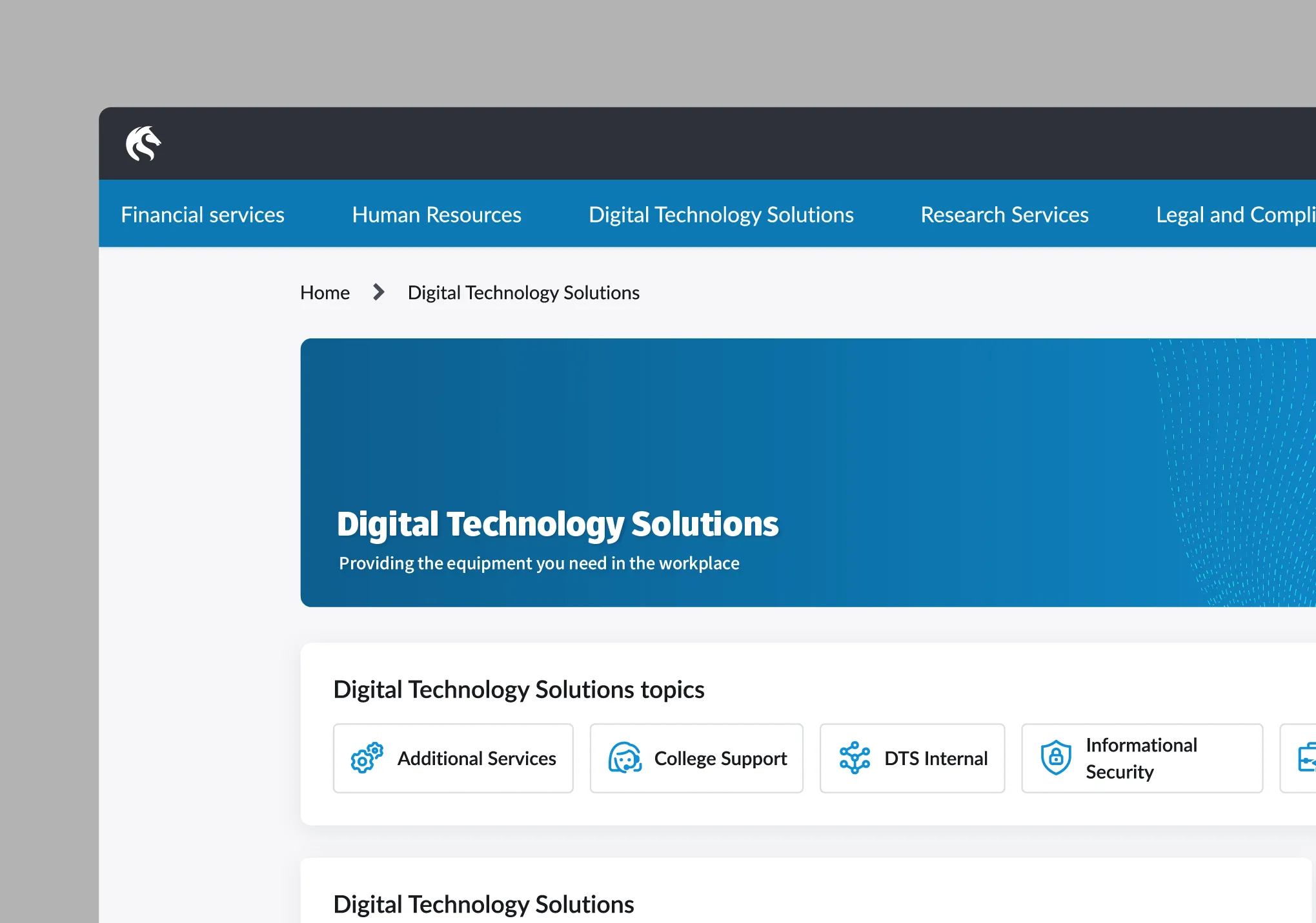
Portal navigation
The original styling of the navigation was originally set to default to the out of the box styling and colours, which would ultimately conflict with the brand guidelines.
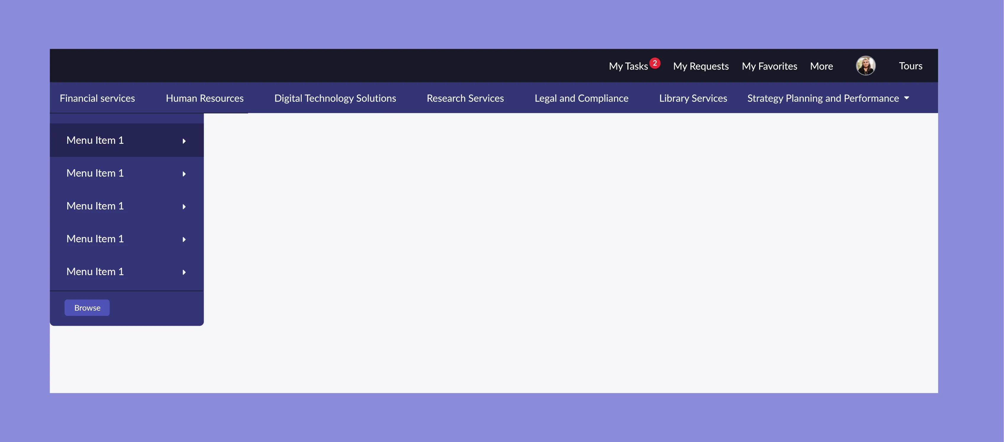
I proposed a redesigned prototype that was using the University blue in a way that was WCAG compliant. I also visualised the way the navbar would step through various topic levels in order for the best usability.
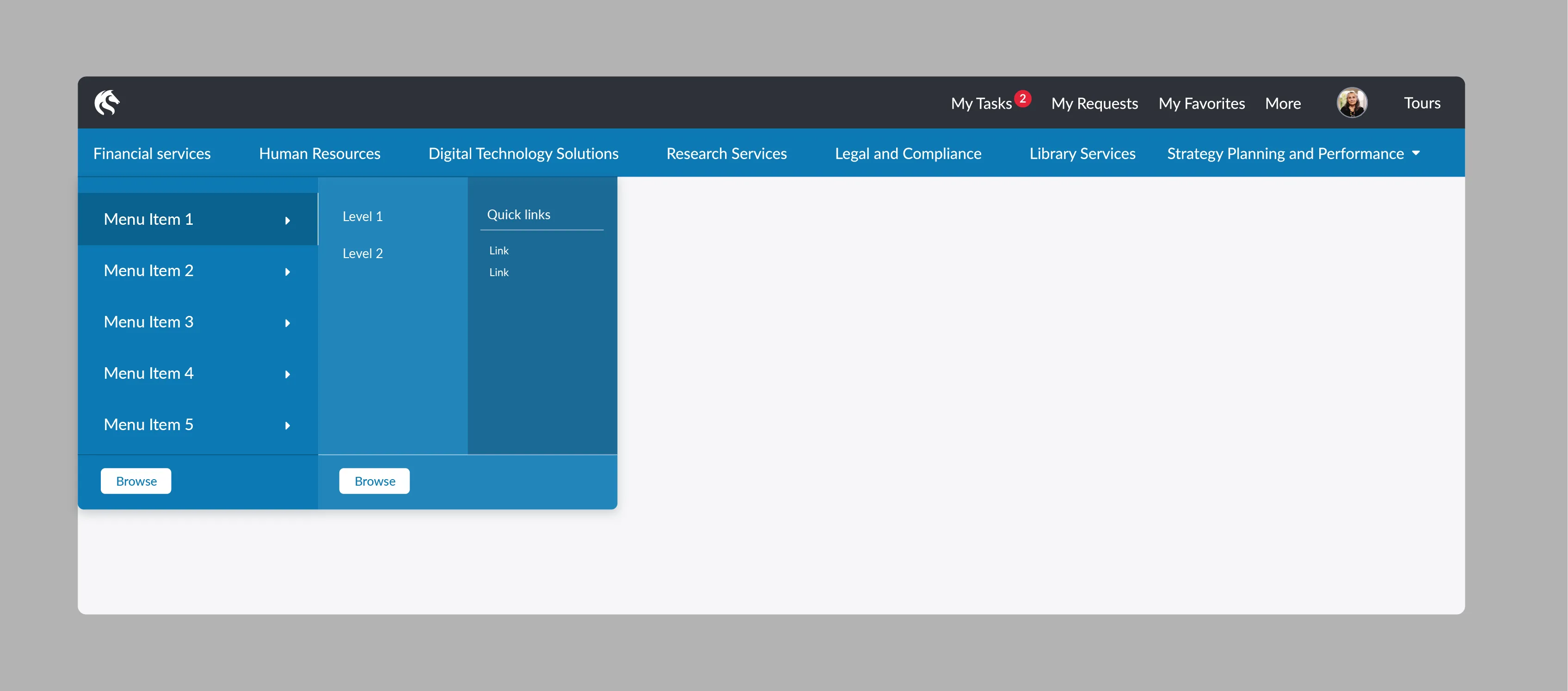
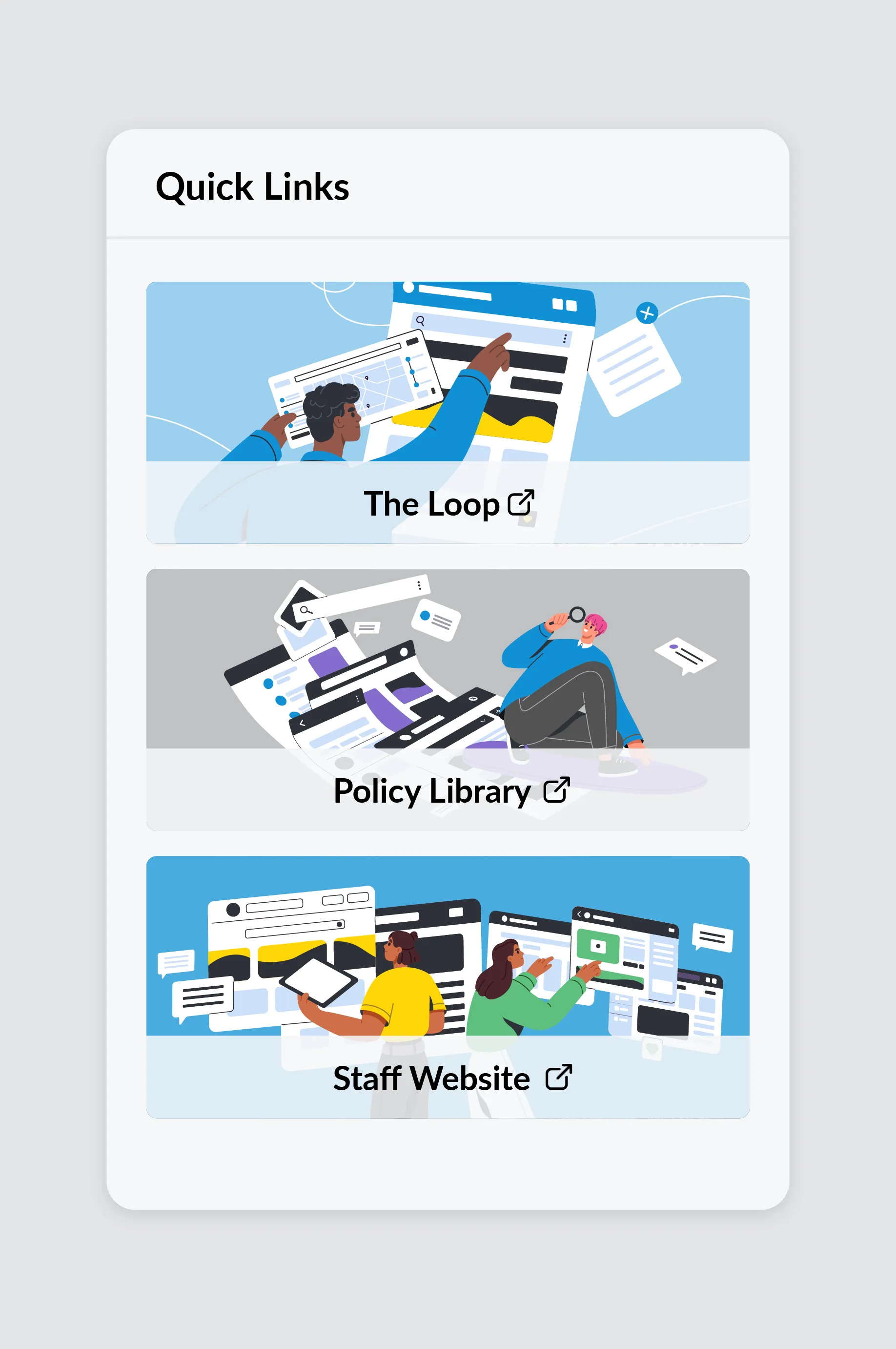
Illustrations were added to the ‘quick links’ widget, to replace the inaccessible photos that were populating them before. This also gave the portal a more contemporary, vibrant interface feeling.
Header Logo
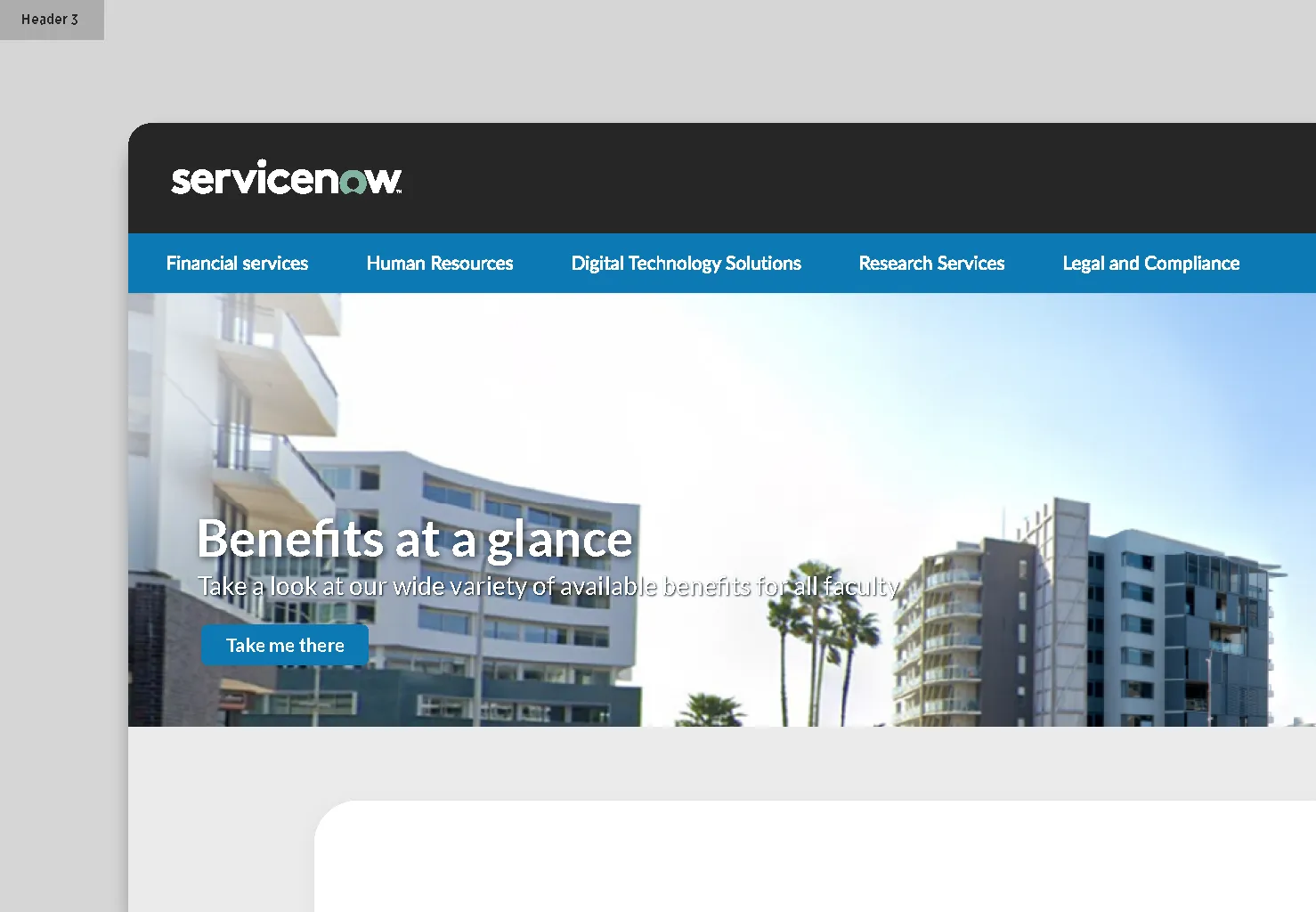
I presented 3 concepts for header branding to suggest alternates to the vendor logo ‘ServiceNow’ which was originally intended to be kept. These additional options were aimed at giving the site a proprietary UON feel, which goes a long way contribute to the consistency of our products.

Colour System
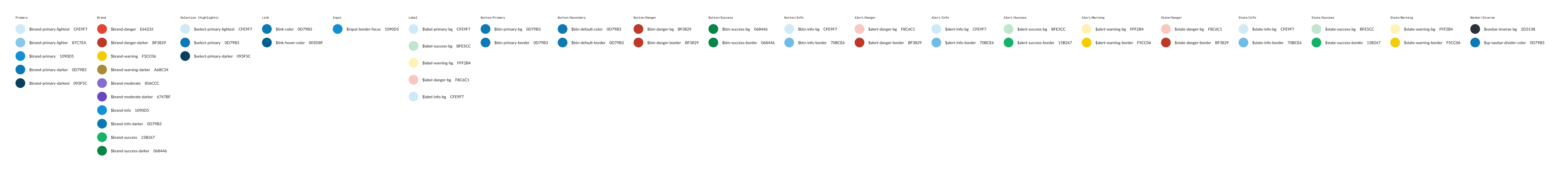
In the process of all this prototyping and through 1 on 1 design jams with the vendor UX/UI designer, I uncovered that we would need to provide a full colour system if we wanted to use our own branding. In the absence of any digital design toolkit I developed a WCAG accessible 50+ colour system tailored to the employee portal, ensuring ease of access and dev through the OOTB tagging system.
I worked with vendor provided figma systems to align all our desired colours and delivered all of them with names and hex codes.
UON Employee Portal Colour System - Figma
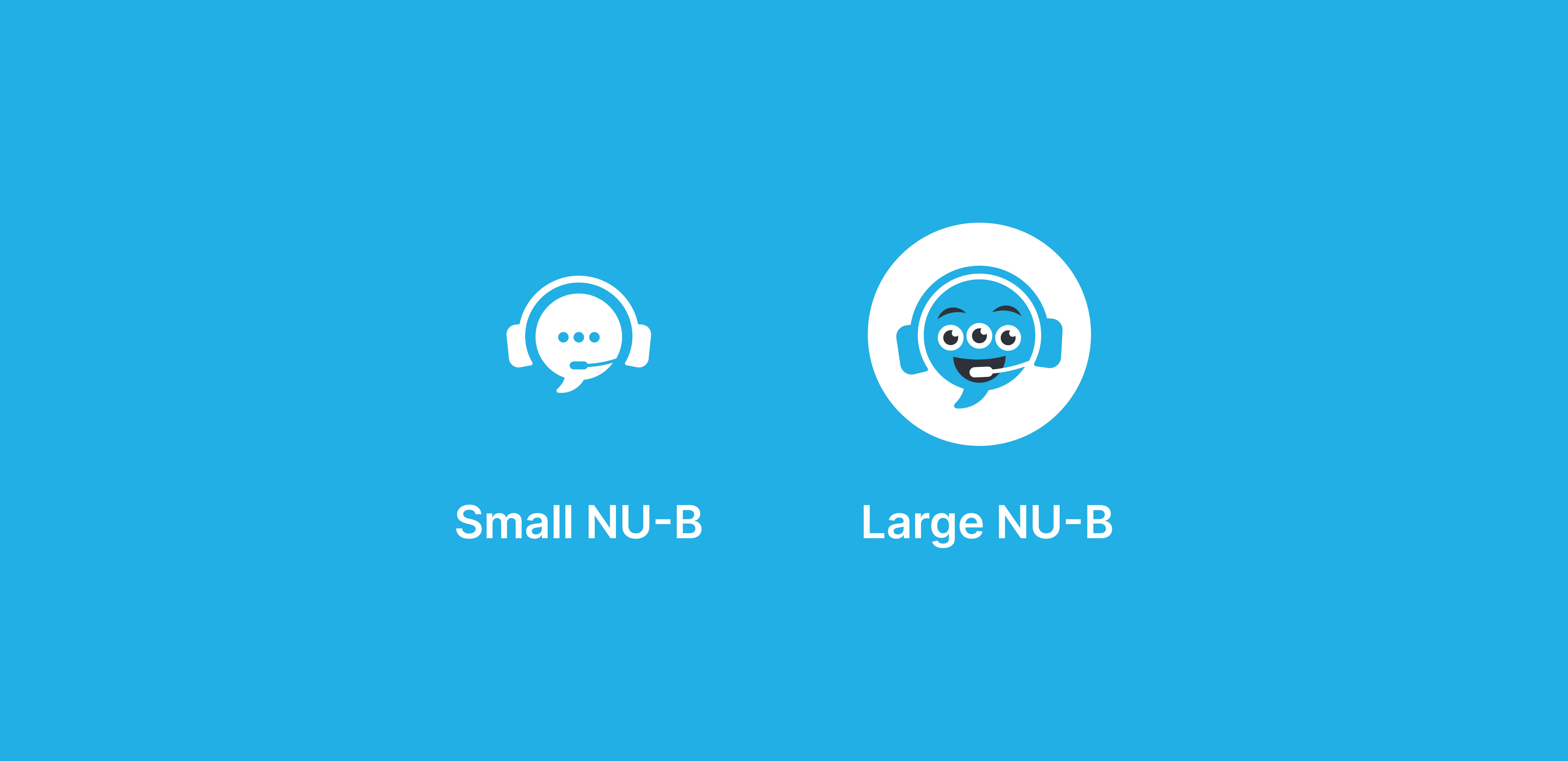
Virtual Agent Experience
As with other parts of this project, the design of the virtual agent was done through multiple iterations through feedback with the project team and platform lead. The goal was to attach a personality to the agent visually, to align with the name NU-B.
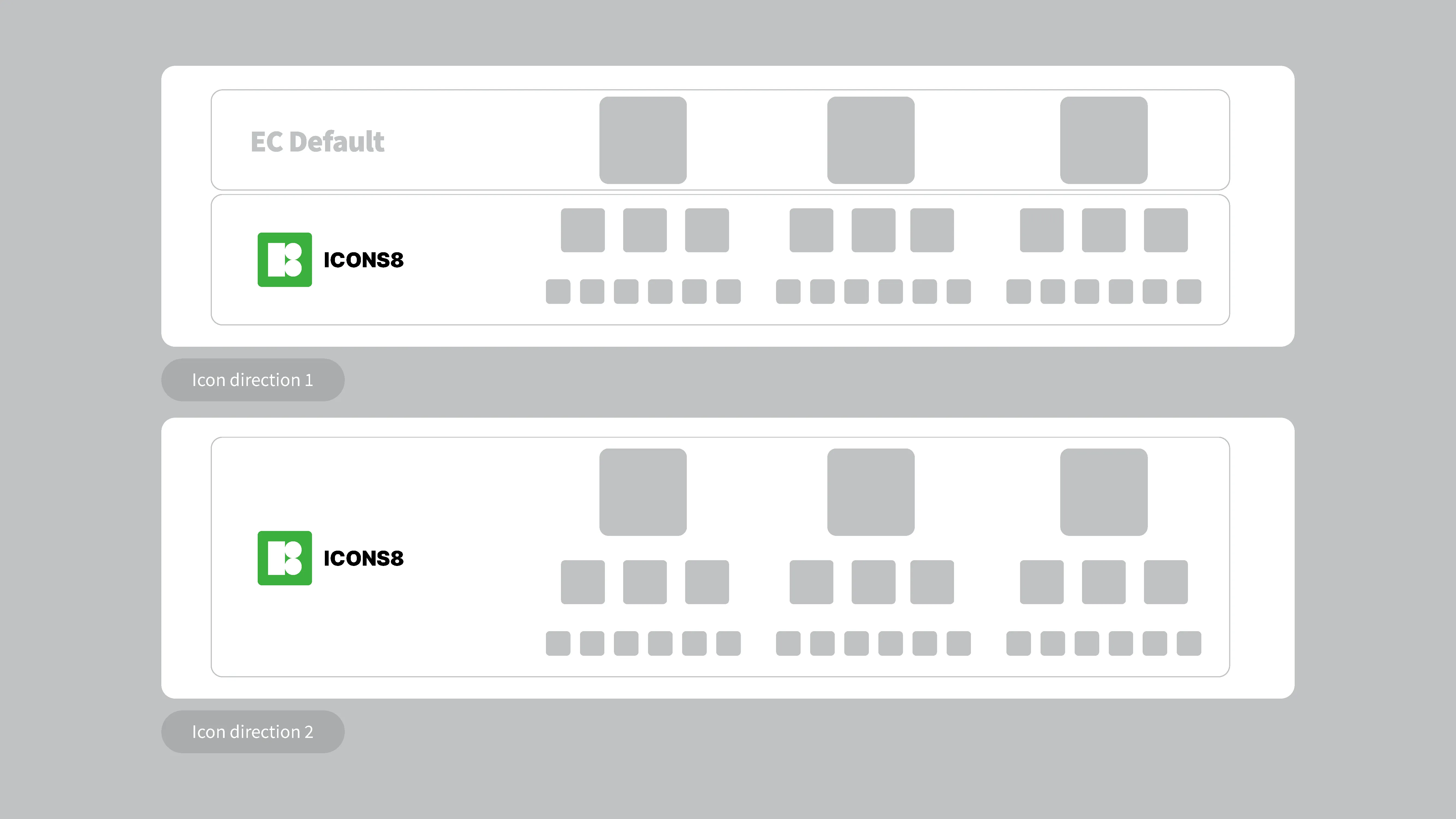
I delivered multiple icons aimed at accessibility across different sizes while maintaining readability and consistent design language.
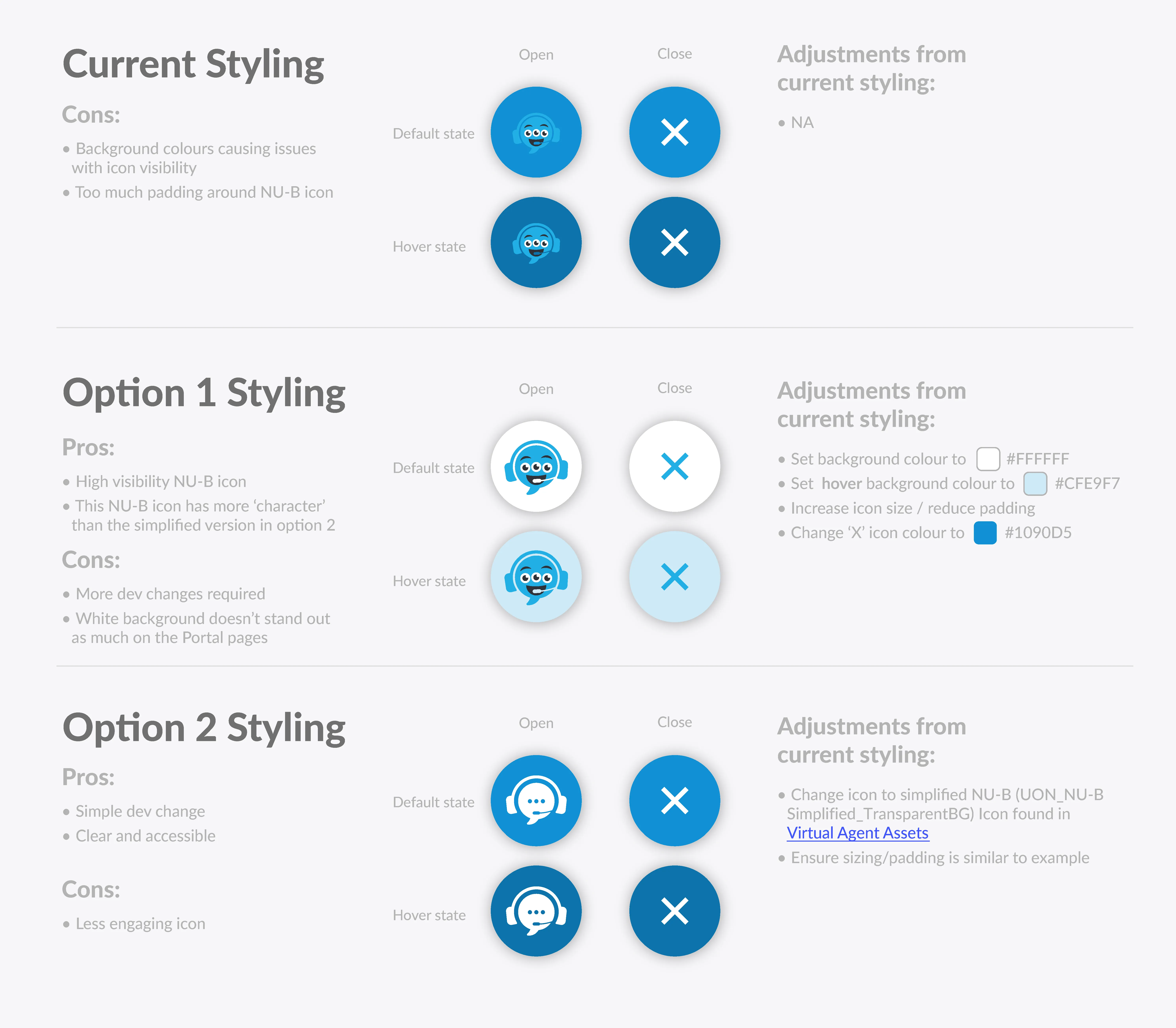
The below is a document I created for the vendor dev team to guide usage and styling of the icons on the portal homepage.
I also pitched the use of an animated character GIF in the opening of the agent. Although not intended to be a long term feature, this would be implemented to help build familiarity with NU-B for potential roll-out across multiple platforms and improving the onboarding experience.